

Overview
WunderMap is our interactive mapping experience for Weather Underground, in the last year we have been refining the data and streamlining the back end. In addition the business was changing from Google Maps to Mapbox so I created new basemaps for our new data layers coming from the new repository, we also used this opportunity to refresh the UI.
Problem
WunderMap was hard to use, was not responsive, too many layers without any grouping or description, and worse, it was an absolute bear to load. However it was a differentiator for Weather Underground and had a strong user following for it.

Old WunderMap only worked on large screens, but had many confusing options. Nested layers and layer behind gear icons.
Company: Weather Underground, The Weather Company
Roles: UX/UI Design Lead, Mapmaker
Project Type: Collaborative
Live: WunderMap
Phase 1 - New Basemaps in Mapbox
Problem
For many years we used Google Maps for our basemaps, within that system we created many basemaps and interactive maps throughout our site, both mobile and big web, to show off weather data.
Development
For 6 months we have started a partnership with the growing Mapbox to create a new set of maps for all of Weather Underground. I worked with the Mapbox team to code and design new maps specifically to display weather data. Most importantly radar, satellite, and our weather station data had to shine on these maps. I made three types of basemaps, making sure that the maps got more detailed when zoomed in but showing the right amount of detail so that the user could use the geography on the map to orient themselves but not too much detail that it cluttered the data. The three basemaps created were a general road map with airport information, and a light and dark simpler version. These maps are used throughout the site most notably the homepage, city forecast page, severe page, full screen weather, and the new WunderMap.


New Mapbox styles for WunderMap that promoted better visibility of data layers on top of the map. Three custom map styles for WunderMap: Light, Dark, and Terrain.
Phase 2 - Wundermap UX/UI Refresh
Problem
With the new basemaps and data layers, WunderMap needed to be rebuilt, we used this opportunity to look at the pain points that users had been experiencing with the product. The largest issues were on load speeds, not working on mobile devices, and hidden layers.
Testing and Design
Many features within the WunderMap were hidden behind menus and gear icons without a reason where they were hidden. We worked to bring out the most used features in the best way and make layers such as the Model Maps more visible and in the forefront. We combined all the map settings under a single menu and had layer opacity options at the user's fingertips. Throughout the process we analyzed what was used most so that launching was in an agile fashion and that the framework is there and simple enough to build more layers into it.
We also created a mobile version of WunderMap since the mapping service would be able to load on cellular devices now. Instead of creating a responsive design that would stay the same from a large screen to a smaller screen, we created a layout specifically for mobile
Outcome
We now can serve interactive maps faster throughout the entire site, and have built a framework that is easily updated. We have continued to add new features as they are available. With this refresh WunderMap has less crashes and loads faster, which is beneficial for users on different connections, and mobile devices. Also with new Co-branding guidelines I helped lead, we also created an official WU Co-branded logo for WunderMap.

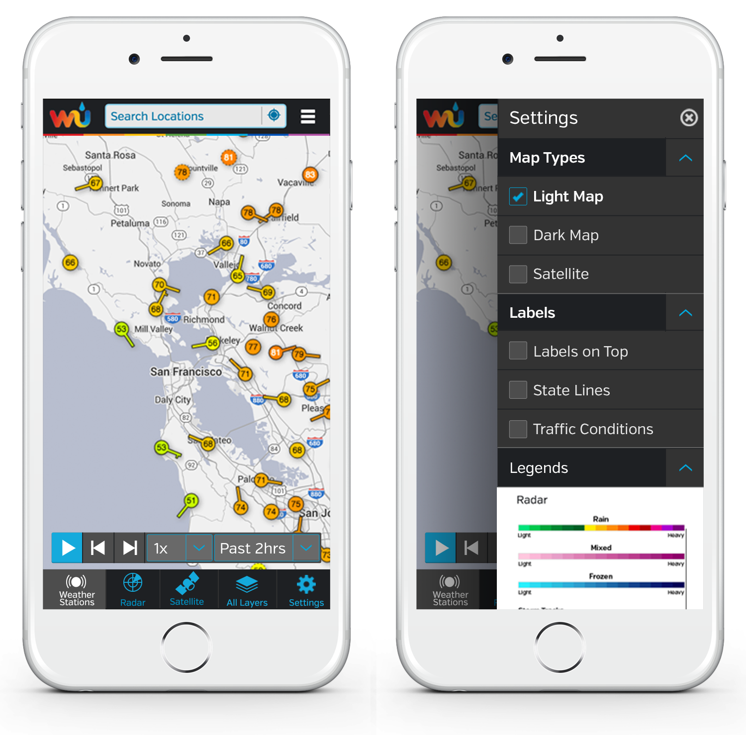
WunderMap on mobile, full screen and with settings menu open.

WunderMap on larger screen.